18 November 2026
Cafe Window Display Ideas That Draw People In
Presented by @beauxoid182
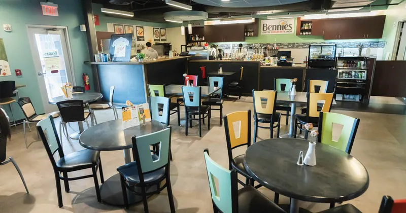
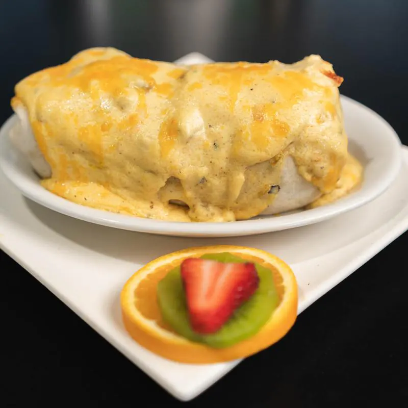
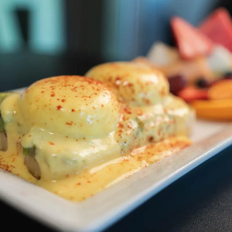
A cafe window has a job that starts long before anyone tastes the coffee. It works on the street, in weather, through rush hour, and in the slow patch between lunch and school pickup. It has to catch the eye of someone already walking somewhere else, tell them what kind of place you are, and make stepping inside feel easy. That is a lot to ask of a few square feet of glass.
The best window displays do not rely on decoration alone. They sell a mood, a level of quality, and a sense of welcome. They suggest whether the cafe is quick and energetic, quiet and thoughtful, family friendly, design led, or known for baking. A good display also respects a practical truth that owners learn fast: if the window looks cluttered, dusty, or overworked, people assume the service and food may be the same.
What draws people in is rarely one dramatic prop. More often, it is the combination of visibility, restraint, and a few smart details placed with intent.
Start with the question a passerby is asking
Most people passing a cafe window are deciding three things almost instantly. Is this place for me? Is it worth stopping? Can I understand what it offers without effort?
That means the first priority is clarity. If the glass is packed with flyers, payment stickers, handwritten notices, and seasonal cutouts, the passerby has to work too hard. Good retail windows create curiosity. Great cafe windows do that while also reducing uncertainty.
From experience, the most effective displays answer obvious questions without shouting. You want people to see signs of freshness, care, and atmosphere. They should be able to spot coffee equipment, baked goods, seating, or a glimpse of staff movement within a second or two. If your concept is specialized, perhaps single origin espresso, Japanese sandos, gluten free pastries, or late evening desserts, the window should make that legible.
A useful exercise is to stand across the street and look for five seconds. Not ten minutes, five seconds. If you cannot tell what kind of cafe it is, the window is underperforming.
Let the inside do some of the selling
One of the most common mistakes is treating the window like a poster board instead of a frame. People are naturally drawn to life in motion. Steam from a machine, a barista pouring milk, cakes under warm lighting, a couple talking at a small table, these are stronger than most printed graphics.
That does not mean every cafe should leave the window bare. It means the display should not block the most attractive parts of the business. If your pastry case is beautiful, let it be seen. If your interior has character, perhaps tiled counters, hanging plants, old wood, open shelving, or a gleaming espresso machine, make the window a view into that scene.
This matters even more for smaller independent spaces. Chains often rely on brand recognition and foot traffic. An independent cafe usually wins by feeling personal. A window that gives a glimpse of the room beyond feels more trustworthy than one fully covered in promotional material.
One neighborhood cafe I worked with had a habit of crowding the front glass with signs about Wi-Fi, loyalty cards, live music, special blends, and social handles. The interior was warm and attractive, but from the pavement it looked chaotic. We removed about 80 percent of the signage, shifted a display of pastries closer to the glass, and adjusted the lighting so the cakes read better in late afternoon. Foot traffic did not double overnight, nothing ever works that neatly, but walk-ins increased noticeably over the next few weeks, especially among first-time customers.
Use lighting like a shopkeeper, not a decorator
Lighting changes everything. A thoughtful window display in poor light disappears by late afternoon. An ordinary display in good light can look inviting for twelve hours straight.
Natural light can help during the day, but it is unreliable. North-facing windows, shaded streets, and winter afternoons flatten the scene fast. Warm, directional lighting aimed at products near the window gives shape and depth. You want enough brightness to separate the cafe from the street, but not so much that the glass becomes reflective and hides everything inside.
For food displays, warm light usually performs better than cool light. Pastries, bread, and wood surfaces tend to look richer and more appetizing. Cool white can work for a crisp modern concept, especially if the brand leans clean and minimal, but it can also make baked goods look dry.
A strong rule of thumb is to light the thing you most want to sell. If your margins are best on pastries with coffee, highlight the pastry display. If brunch is the draw, show plated dishes in a way that reads clearly from outside. If your brand is built around beautiful equipment and craft, make the espresso bar visible and well lit.
The window should still feel believable. Overlit displays can look stagey, and when the rest of the room falls into darkness, the contrast becomes Cafe uncomfortable. People want to enter places that feel alive, not theatrical.
Build around one story, not ten
Window displays fail when they try to communicate every offer at once. If the cafe serves breakfast, lunch, desserts, retail beans, teas, and weekend specials, that does not mean all of it belongs in the glass.
Choose one lead story for a period of time. It might be buttery croissants in the morning, iced drinks in a heatwave, orange and cinnamon loaves in autumn, or evening tiramisu and affogato on Fridays. When the display revolves around one clear idea, it becomes memorable.
This is especially useful for seasonal rotations. Many operators think seasonal means adding more objects, more color, and more copy. In practice, the best seasonal windows often change only a few elements. A linen runner, a crate of blood oranges, and a sign for winter citrus cake can say more than a full sheet of snowflake decals and six competing chalkboards.
Restraint feels premium. It also ages better over the course of a month.
Put real products in the foreground whenever possible
People trust real things more than representations. If the cafe has beautiful viennoiserie, a whole cake on a stand, fresh focaccia, or bagged house beans, those should appear in the display. They carry texture, scale, and appetite appeal in a way printed photos rarely match.
There are caveats. Fresh food near direct sun can degrade quickly. Butter pastries slump. Chocolate bloom appears. Greens wilt. Cream cakes may need refrigeration that is not suited to the window. The answer is not to abandon real products, but to choose durable stars and rotate them intelligently.
A display can combine real and representative elements. For example, a stack of branded bean bags can sit beside one perfectly styled cake under a cloche, while a small sign references the full pastry selection at the counter. If direct sun is strong, shift food displays to the hours when they look their best and rely more on equipment, vessels, flowers, ceramics, or packaging at other times.
Good display work often comes down to maintenance. A mediocre arrangement refreshed twice a day will outperform a more ambitious one left to stale and sag.
Show signs of abundance, but keep the composition tidy
Scarcity can feel exclusive in fashion retail. In a cafe window, it often just looks understocked. Most food-led businesses benefit from visual abundance. A tray with one lonely muffin says the day is almost over. A display with grouped pastries, layered heights, and a sense of replenishment says the place is busy and fresh.
Abundance should not slide into clutter. The eye needs a focal point. Group items in odd numbers, vary height using cake stands or boxes hidden beneath cloth, and leave some breathing room around the hero product. Think market stall energy arranged with gallery discipline.
If you have a narrow frontage, avoid the temptation to fill every inch of sill. One elegant composition reads better than five disconnected mini displays. If you have wide glass, divide the scene into zones with a clear hierarchy. Perhaps baked goods nearest the path of travel, a low sign with key items and hours, and a deeper sightline into Cafe the seating area.
People do not read windows the way owners do. They do not pause to decode every object. They scan, sense, and decide.
Signage should reduce friction, not create noise
A cafe window usually needs some text. The problem is not text itself. The problem is too much of it, or text that competes with the visual message.
Hours, key offer, and perhaps one short brand cue are often enough. “Coffee, pastries, and lunch” tells a passerby more than a paragraph about your sourcing philosophy. Save the deeper story for the menu, website, or a subtle in-store sign where someone already wants to know more.
Handwritten signage can work well when the brand is warm and casual. It can also look messy if every notice uses a different pen, board, style, and tone. Printed signage can look polished, but it risks feeling generic if overused. The right answer depends on the cafe. What matters is consistency and legibility from a distance.
Keep pricing choices strategic. A visible entry-level price point, such as coffee from a certain amount, can reassure budget-conscious customers. On the other hand, filling the window with price tags can cheapen a carefully positioned brand. If your cafe competes on craftsmanship and atmosphere rather than lowest cost, the window should reflect that.
A short checklist helps when deciding what deserves space on the glass:
- Can a person understand the cafe in under five seconds?
- Is the main offer visible without reading more than a few words?
- Are the hours easy to find?
- Does the signage leave room for the interior to show through?
- Would a first-time visitor feel welcome, not overwhelmed?
Work with the street, not against it
The same display will not perform equally on every street. A commuter route calls for speed and clarity. A neighborhood high street allows more charm and detail. A tourist area may reward local character and photo-friendly touches. A business district may respond better to sharp visibility of takeaway drinks and breakfast items before 9 a.m.
Watch how people move past your frontage. Do they approach from one dominant direction? Is there a bus stop opposite? Are there trees causing shadow at certain times? Does traffic reflect harsh light onto the glass? These details matter more than many owners expect.
One practical example: if most foot traffic approaches from the left, put the strongest visual cue slightly left of center so it catches peripheral vision sooner. If the pavement is narrow, keep the lower part of the window clean and readable because people will view it from close range. If there is a lot of evening passing traffic, prioritize warm internal lighting and a display that still reads after sunset.
The local audience should shape the message. A family-heavy area might respond to visible cakes, large cookies, and a few comfortable seats in view. A younger crowd might notice a sleek iced drink setup, strong typography, and a window that photographs well without looking designed purely for social media.
Seasonal displays that feel current without becoming cheesy
Seasonality is useful because it gives regulars a reason to notice the window again. The risk is drifting into decoration for its own sake. A cafe is not a department store. Seasonal changes should support appetite, mood, and the character of the space.
Spring can lean into freshness, lighter colors, flowers used sparingly, lemon cakes, and more daylight through the glass. Summer often benefits from height, brightness, and visible cold drinks. Clear vessels, citrus, striped linens, and signs for iced coffee or soft serve can work well. Autumn suits texture, deeper tones, apples, pears, cinnamon pastries, and warm lighting. Winter rewards glow, richness, and a little density, perhaps panettone, spiced loaves, dark ceramics, and quiet greenery rather than plastic sparkle.
The strongest seasonal windows often use materials that belong in a food environment. Fruit, branches, linen, timber, ceramics, paper, and chalk tend to age better than novelty props. They also keep the display grounded in hospitality rather than craft-store theatrics.
Give people a reason to stop, not just look
There is a difference between an attractive window and a productive one. Some displays win admiration but not footfall. To convert attention into entry, add one or two prompts that make stopping feel natural.
This could be a pastry finishing station visible from the street, a cake of the day placed at eye level, a window seat occupied by a great-looking coffee setup, or a short sign announcing a fresh batch just out of the oven. Movement helps. So does evidence of timing. People are responsive to the idea that something is available now, not just generally.
The display should hint at what happens next. If someone comes in, what will they buy first? If your highest-converting combination is coffee and pastry, the window should stage that duo. If you want more afternoon trade, show desserts and slower, more relaxed seating. If takeaway is the goal, make that path feel easy and visible from outside.
One thing I have seen repeatedly is the power of a single recurring cue. It might be a cake stand changed daily, a basket of still-warm buns at 8 a.m., or a Friday evening dessert sign in the same place each week. Regularity trains repeat customers to look.
Keep branding present, but let hospitality lead
Strong branding matters, but cafes are not pure branding exercises. People come for comfort, routine, flavor, and atmosphere. The window should reflect the identity of the business without feeling overcontrolled.
That means logos should be visible but not dominant. Brand colors can appear in packaging, menus, or small props rather than splashed over every surface. A distinctive typeface helps, as do repeated material choices such as brass, oak, matte black, terrazzo, or hand-thrown ceramics. These quieter signals often feel more sophisticated than loud graphics.
If the cafe has a memorable specialty, let it become part of the brand language in the window. A bakery-led cafe might always feature flour-dusted loaves and layered pastries. A coffee-first shop might foreground grinders, cups, and a clean brew bar. A dessert cafe might treat plated sweets as its visual signature. Branding is strongest when it grows from the product.
Common mistakes that quietly cost you customers
A window display does not usually fail because of one disastrous choice. More often, it suffers from small habits that build up over time. Temporary signs become permanent. Cleaning slips. Sun-faded posters stay up. Christmas lighting remains in February. Packaging piles up on the sill because staff are busy.
The issues worth watching most closely are simple:
- Dirty glass, fingerprints, and dead insects around the frame.
- Too many stickers for apps, cards, and delivery platforms.
- Signs that block sightlines to the counter or pastry case.
- Props unrelated to food or atmosphere, added just to fill space.
- Displays that look identical at 8 a.m. And 5 p.m. Even though trade patterns change.
The fix is not expensive. It is usually procedural. Someone should own the window. Not vaguely, specifically. A named person checks it in morning light and again before the afternoon rush. They replace tired items, wipe glass, straighten signage, and make sure the display still says what the business wants it to say that day.
Small budgets can still create strong windows
Some of the smartest cafe windows are built on modest budgets. They work because the owner understands proportion, cleanliness, and story. You do not need custom fabrication to create impact.
A few cake stands at different heights, a well-made sign, one strong spotlight, a seasonal ingredient used decoratively, and a clear line of sight into the cafe can be enough. Fresh flowers from a wholesaler can work, but so can branches, herbs, or market fruit if styled with care. Good linen has surprising power. So do trays, timber boards, and ceramic vessels already used in service.
If money is tight, spend where people notice quality first. Clean glass, better lighting, and one or two display pieces with real presence will do more than a pile of cheap decorative items. Customers are quick to sense when a display is trying too hard without saying anything meaningful.
Test, observe, and edit ruthlessly
The best window displays are not designed once and forgotten. They are tuned. Owners often know when sales are soft, but they are less disciplined about tracing which visual changes affect walk-ins. A little observation goes a long way.
Change one element at a time where possible. Move the pastry display forward for a week. Simplify signage. Add a visible takeaway offer. Adjust the evening lighting. Then watch. Ask staff whether more first-time customers mention the cakes, the coffee, or the seasonal special. Notice whether people pause outside more often. Track whether a promoted item near the window actually sells faster.
Do not assume more effort equals better results. Some of the strongest displays look effortless because they have been edited hard. Good judgment often means removing what the owner likes in order to reveal what the customer needs to see.
A cafe window should feel alive, generous, and easy to read. It should make the promise that stepping inside will be pleasant and worthwhile. When that promise is clear, people do what you want them to do. They slow down, they look again, and then they come in.
Bennies Cafe
17230 Jackson Creek Pkwy Ste 100, Monument, CO 80132
+1 719-445-0660
FAQ About Cafe
What is considered a café?
A café is generally an informal place to enjoy refreshments and a meal. Bennies Cafe in Monument serves breakfast and lunch in a counter-service setting, with options including eggs Benedict, sandwiches and crepes. Guests can eat in or arrange pickup.
What is the difference between a coffee shop and a café?
The terms often overlap. A coffee shop usually emphasizes coffee and other drinks, while a café may offer a broader food menu. Check the individual establishment's menu rather than relying on its name. Bennies Cafe offers coffee drinks alongside breakfast and lunch dishes.
What is the difference between café and coffee?
In everyday English, a café is a place where people buy food and drinks, while coffee is the beverage. The word café comes from the French word for coffee. Bennies Cafe serves options such as brewed coffee, espresso and lattes as part of its drinks menu.